1. News stand can not easily be put into a folder.

I like having all my apps neatly organized into folders. This gives me a quick way to find anything, without having to type in the search box to search through all of my apps. There's only one problem. Newsstand won't go into a folder, or at least not in the way that we all got accustomed to for other apps. There is a way to do it, but you need to be very quick, newsstand doesn't work for as long as it is located in a folder, and the trick is impossible to do while using voiceOver :(.
2. the iPhone media player controls
 A lot of apps on IOS devices use the standard media playing interface. The problem is that since the introduction of airplay, the buttons are closer together than they used to be. Especially in audiobooks and podcasts, where your current position in a track is saved, accidentally pressing the 'previous track' button is irritating, as it puts you back to the start of the track, making you loose your saved position. Marco Arment has an excellent suggestion on his blog on how this could be solved.
3. There's no setting for when to warn me about a low battery
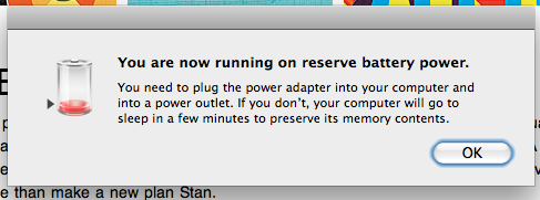 Less is more, that has always been one of apple's design principles, and they also take this approach when it comes to the customizability of the system. A great deal of the ease of use of apple's products comes from the lack of things you can do wrong.
However, in this case, I believe an extra option would be nice, a way to set at what percentage of battery life, a low battery warning should be shown. By default, it shows the warning when there are 10 minutes of usage left. For me, that's way too long. I'm a huge procrastinator, if I don't need to do something now, I'll do it later. I want that message to be shown to me when there's only 1 minute left, so that I need to plug it in immediately.
It would be even better to have the option of setting multiple warnings, one 10 minutes in advance, and 1 one minute in advance would be perfect for me. This way, I wouldn't start a game of portal, forgetting about the dialog I've just seen, only to see the screen go black in the middle of a battle against GLaDOS.
4. Modal dialogs should darken the background
The battery warning problem brings me to the next problem. This may be too much nitpicking since it only applies to a small audience, but when you're using a mac when a modal dialog such as the low battery dialog pops up, while you're using the screen magnifier, you can't click on anything but the dialog. This can be confusing when the dialog is not in the part of the screen thats currently visible. I therefore think that the background behind modal dialogs should be darkened, to draw the eye towards the dialog, and to notify the user of such a dialog, when the part of the screen containing the dialog box is not currently visible.
5. Arrow key navigation within dialogs
currently within a dialog, you can use the tab key to switch the focus between options, but you can't navigate by simply using the arrow keys. I find using the arrow keys much more intuitive than repeatedly pressing tab to navigate around. I also believe that in order to be able to use the tab navigation in any dialog, you need to select this in the keyboard options section of your system preferences, otherwise, tab navigation is only available in dialogs containing a text input.
6. The edges on the macbook pro used to be way too sharp
I was 'unlucky' enough to buy my macbook pro in 2010, at least in so far you can be unlucky having bought a macbook pro, but mine has edges that are way too sharp, right where my wrist rests. In the winter, that's not a problem, as my sleeves protect me against them, but in the summer it's a pain in the ... umm, wrist. The 2011 model however, does have the edges rounded off. To see the change, and a video on how to fix this edgy problem, look here.
I agree that having customizable low battery warnings could be helpful.
ReplyDelete